The logo name comes from the Hebrew word for “learning,” with a “y” added at the end to give it a more playful, childlike feel.
Colors
A bright, colorful palette combined with big, fun icons to make the design lively and easy to navigate.
Fonts
Clear and legible fonts; the titles are in a large, formal font, while the secondary font is lighter and simulates handwriting.
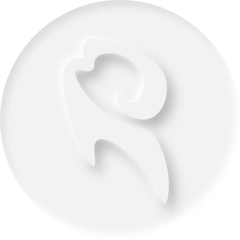
Logo
The previous logo has been redesigned; I added a hand to reference the idea of yin and yang and create balance.
Colors
The color palette conveys softness, tranquility, and warmth
Fonts
The fonts are aimed at simplicity and creating a sense of closeness.
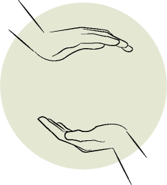
The Logo Transformation
I added deeper layers of meaning to the Shiatsu logo. To create balance, I introduced a second hand closing in from the opposite side, centering the name within the logo. The hands suggest movement, softness, and touch while also echoing the flow and form of yin and yang.
The Designing process
In the branding design, I drew inspiration from key elements of Shiatsu. I focused on expressing softness and movement through the design languageusing rounded shapes and delicate lines to create a clean, gentle look that reflects the calm and pleasant feeling of Shiatsu treatment.